
.png)
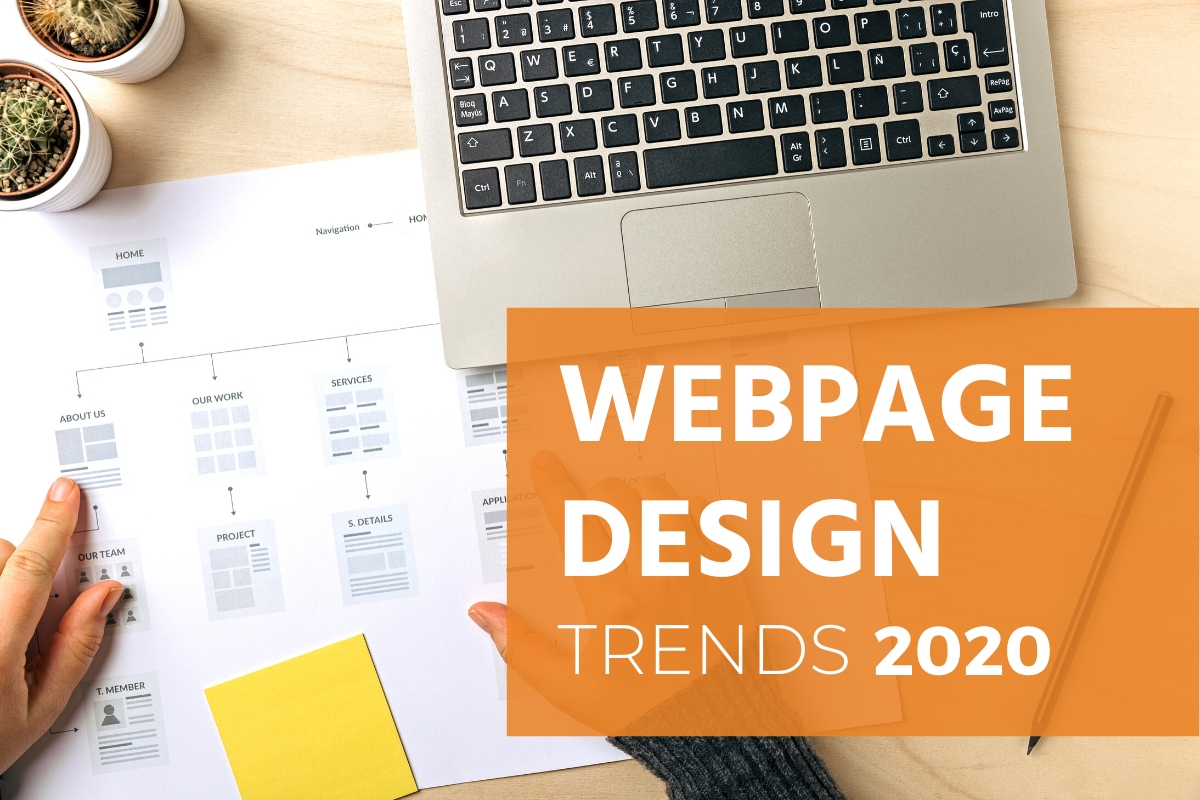
Following the most recent 2020 website design trends gives you a real advantage. It helps you create a site that others respond to because of its relevancy.
In the design world, you should scrutinize every square inch of real estate you make available for the public to view. After all, you rarely get a second chance to make a great first impression. To keep user attention, you must have a website that is both visually stunning and has a responsive design. That way, it's viewable on all sizes of screens including mobile devices which gain greater popularity each year.
To better understand the frequency in which website design trends change, it's important to know the fundamentals of good web page design. It takes into account things such as a color scheme, visual design, a navigation bar, product design, and calls to action. This guide serves as an introduction to each and helps you shape your brand identity one web design element at a time.
You don't even need to have a background as a graphic designer to create a site that people love. There are plenty of drag and drop websites that allow novice designers to create outstanding professional websites. The only thing required from you is to have basic knowledge of the ideal color palette, and you'll be on your way to 2020 web design excellence.
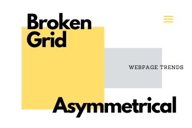
One design element that continues to gain momentum is broken grids or asymmetrical design. Instead of everything reading from top to bottom and left to right in a tightly lined space, the layout pushes past the grid to create a more interesting arrangement to look at. At times, words and photographs overlap slightly. It helps break up the monotony that sometimes occurs with visual design.
Negative space or white space is impactful. If using bold colors, it helps create contrast. It also allows every color of the text to stand out on the page. When designing a website, don't underestimate the power of white space. It can transform the look and feel of your web page quickly.
Good content is king. Video content is transformative. People may not feel like they have time to read an entire article in one sitting. They will, however, watch a video if you've included one on your website. You can summarize your message's main ideas rather succinctly with visual content.
The saying that "less is more" couldn't be truer than online. Web pages that are too busy in appearance make it easy to lose their core messages. The customers that view them may end up feeling confused or frustrated by all the 'bells and whistles' included on the page. A clean, yet simple, design can be more impactful than a lot of extras on a website.
Just as impactful as the website itself, today's logo is far more legible than in the past. Referred to as the 'Helveticization' of fonts, many graphic designers believe that all logos eventually return to a form of Helvetica because of how readable it is online. If you have a logo that is difficult to read, consider changing it. You'll be able to make more of an impact visually when it's on your website or promotional materials.
Help your audience find internal links by making them a bold color that stands out from the other text you include on your site. They'll know to click on the links to find additional information on your blog or website because of the bright colors you chose for the links. It's a subtle design trend that carries over year after year.

Rather than be flat and two-dimensional, today's website illustrations are 3-D. They seem to come to life on the page, which is a great way to grab people's attention from the moment they land on your web page. They'll be able to see your ideas visually and be able to understand your core message without needing to read a lot of text.
From cute animations to unique visual statements, graphic designers display their talents in many ways on the page. The result is one that is interactive and entertaining for your target audience to explore. It provides them with a way to beat the doldrums of your average day by making it more exciting to shop at your site.
Ditch the fancy photographs and illustrations. Instead, use type in a visually stunning way. It's a great way to set your website apart from others. The beautiful thing about typography is that it never goes out of style, too. You can update the fonts you choose to use or even create your own from scratch for a unique appeal all your own.
Authenticity never goes out of style. It's not wasted on your audience, either, who prefer it over canned content and stifled stock images. Focus on creating the type of customer experience you'd prefer for yourself. Explore a design element that you're comfortable with and play with organic shapes that feel natural and familiar to you and your audience for the best results.
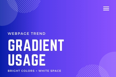
Bold, bright colors command attention. So do gradients that go from lighter to darker or darker to lighter colors to create a visual effect that helps tell your brand's story. Playing around with different color schemes and gradients allows you to determine which route to go. You may want to start light and end up darker or begin with a dark color that gradually turns lighter on the page.
Scrollability is vital because it allows your audience to get from one area to the next on your website. Since a good majority of the population owns and uses a mobile device, you must be able to make your content accessible by phone or tablet. Your audience should navigate with great ease using only their thumbs to scroll to the page that they want to visit.
There is a lot of ground to cover when it comes to website design trends. You can work every suggestion listed here into your web pages or you can choose to focus on one or two that you make the emphasis of your design project. Whichever decision you make, know that you can successfully improve the look, feel, and appeal of your website with or without the help of a graphic designer thanks to the tips listed here.
A free business research report awaits you. All you need to do is request it by contacting us. Learning the ins and outs of website design trends helps you appeal to more people and ultimately sell more to them. By paying close attention to the user experience you create from the top of your webpage to the bottom of it, you're able to identify potential issues and fix them before they become a problem for you.


.avif)